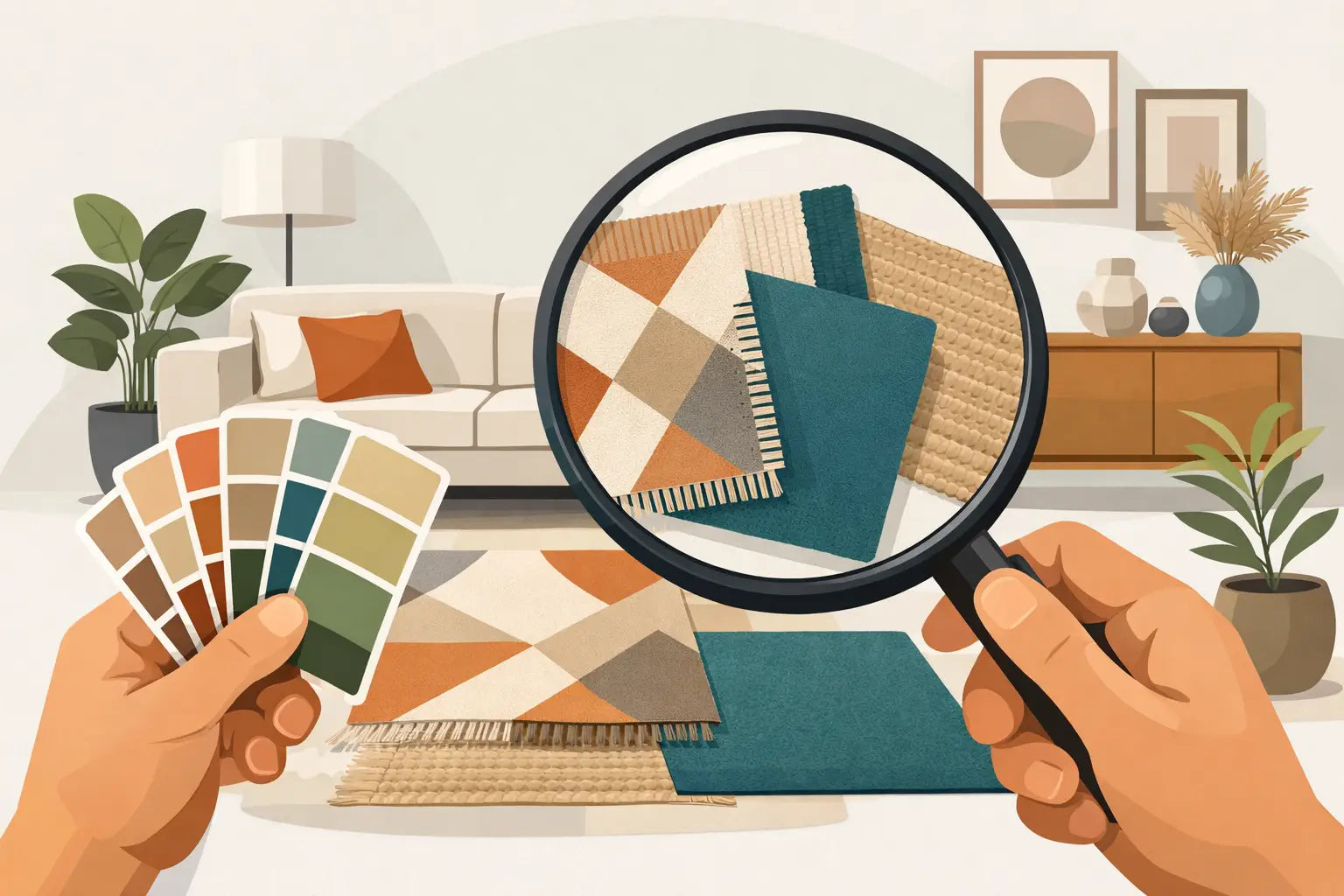
A rug can make a room feel quietly finished or slightly off, and the difference usually comes down to color. If you are wondering how to match rug colors, the goal is not to make everything identical. It is to create a room where the tones speak to each other naturally, with enough contrast to feel considered and enough cohesion to feel calm.
How to Match Rug Colors by Starting With the Room
The easiest mistake is shopping for a rug color in isolation. Rugs do not live alone. They sit beneath upholstery, next to wood tones, under changing daylight, and beside pillows, art, and window treatments that already carry their own visual weight.
Start by identifying the elements in the room that are not likely to change soon. In most homes, that means the sofa, the bed, the dining chairs, the wall color, and the flooring. Those fixed pieces should guide the rug more than smaller accents do. If your sofa is a warm oatmeal linen, your floors are medium oak, and your walls are creamy white, a cool icy gray rug may look disconnected even if it is beautiful on its own.
This is why rug color matching works best when you read the room by temperature first. Warm spaces tend to feel best with rugs that carry warm beige, sand, rust, camel, terracotta, olive, gold, or brown undertones. Cooler spaces often pair more naturally with grays, blue-grays, charcoal, ivory with cool undertones, sage, or muted navy. Neutral does not always mean flexible. A taupe can lean rosy, a beige can read golden, and an ivory can shift cool under north-facing light.
Choose a Color Role for the Rug
A rug does not always need to be the star. Sometimes it should soften the room, and sometimes it should give it character. Deciding the rug's role makes color selection much easier.
If the room already has strong pattern, colorful art, or statement furniture, a quieter rug usually creates balance. Think soft ivory, tonal beige, gentle gray, faded blue, or a subtle border design. These colors help the room feel layered without becoming visually crowded.
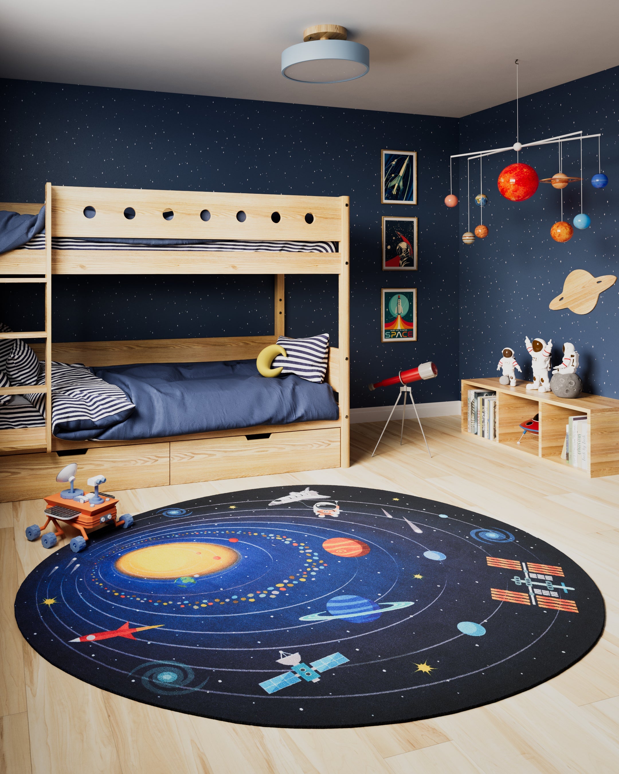
If the room feels plain or unfinished, the rug can do more of the storytelling. A richer palette like blue and terracotta, charcoal and cream, or olive with warm neutrals can bring depth and movement to a space that needs personality. In family rooms and bedrooms especially, a rug with a few mixed tones often feels more forgiving and more lived-in than a flat solid color.
The trade-off is simple. A bold rug creates energy, but it asks the rest of the room to stay edited. A soft rug is easier to style, but it may not add enough dimension if everything else is equally quiet.
Use the 60-30-10 Idea, Loosely
Interior designers often talk about a room's color distribution, and rugs fit beautifully into that framework. You do not need to follow a formula rigidly, but it helps to think in proportions.
Your dominant color is usually the largest visual area in the room, such as walls or a large sofa. Your secondary color might come from curtains, bedding, accent chairs, or wood finishes. Your accent color lives in smaller moments like pillows, artwork, or décor. A rug can either support the dominant color, bridge the dominant and secondary colors, or quietly repeat the accent.
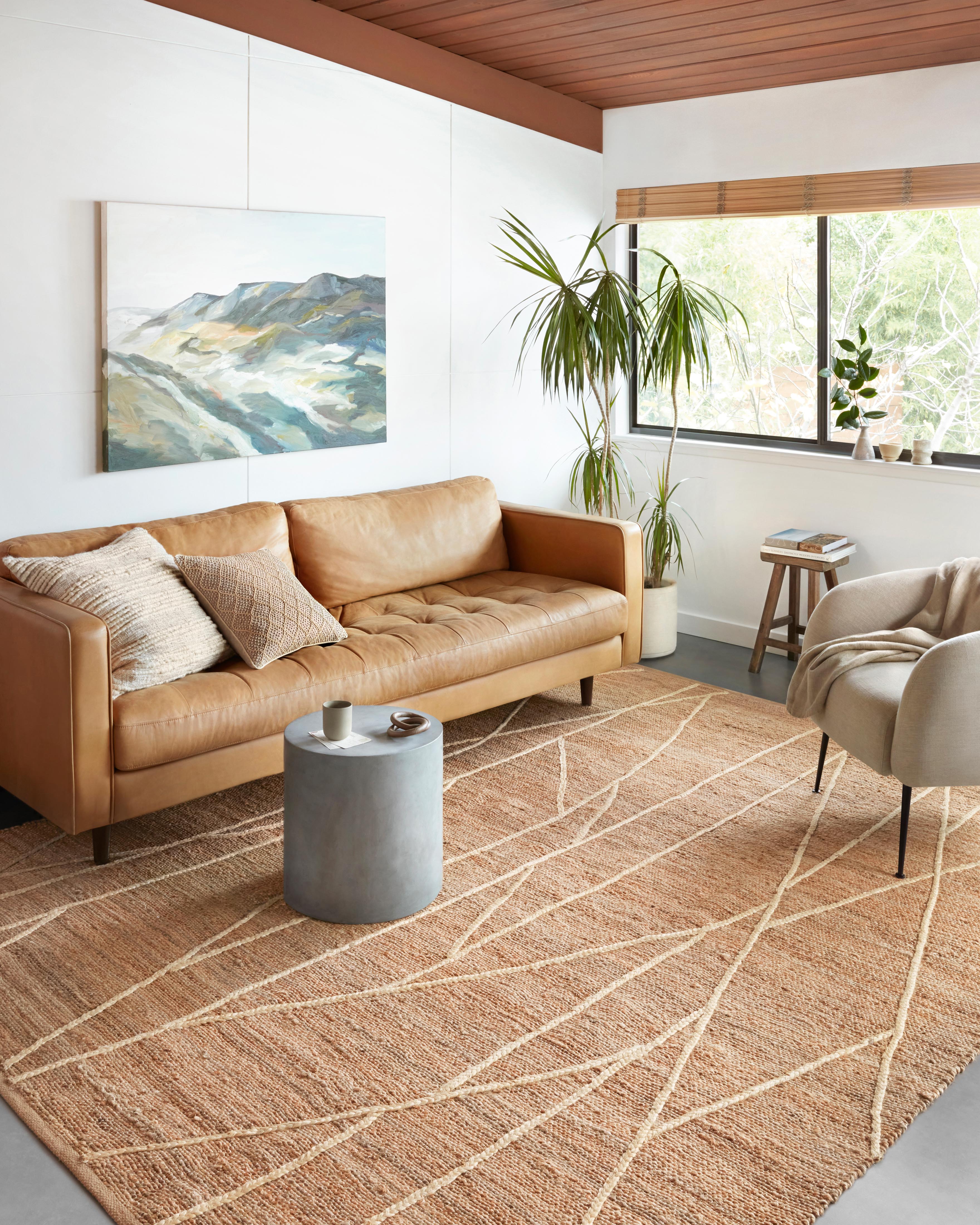
For example, if your living room is built around a cream sofa and light walls, with caramel leather and black accents, a rug that blends cream, camel, and touches of charcoal will feel intentional right away. If your bedroom has white bedding, soft greige walls, and muted blue pillows, a rug with faded blue woven through ivory or taupe can connect everything without looking overly matched.
That "not overly matched" part matters. Rooms tend to feel more elevated when the rug references existing colors rather than copying them exactly.
How to Match Rug Colors With Flooring
Flooring is one of the most overlooked parts of rug selection, even though it frames the rug every single day. The right rug color should either complement the floor or create enough contrast to define itself clearly.
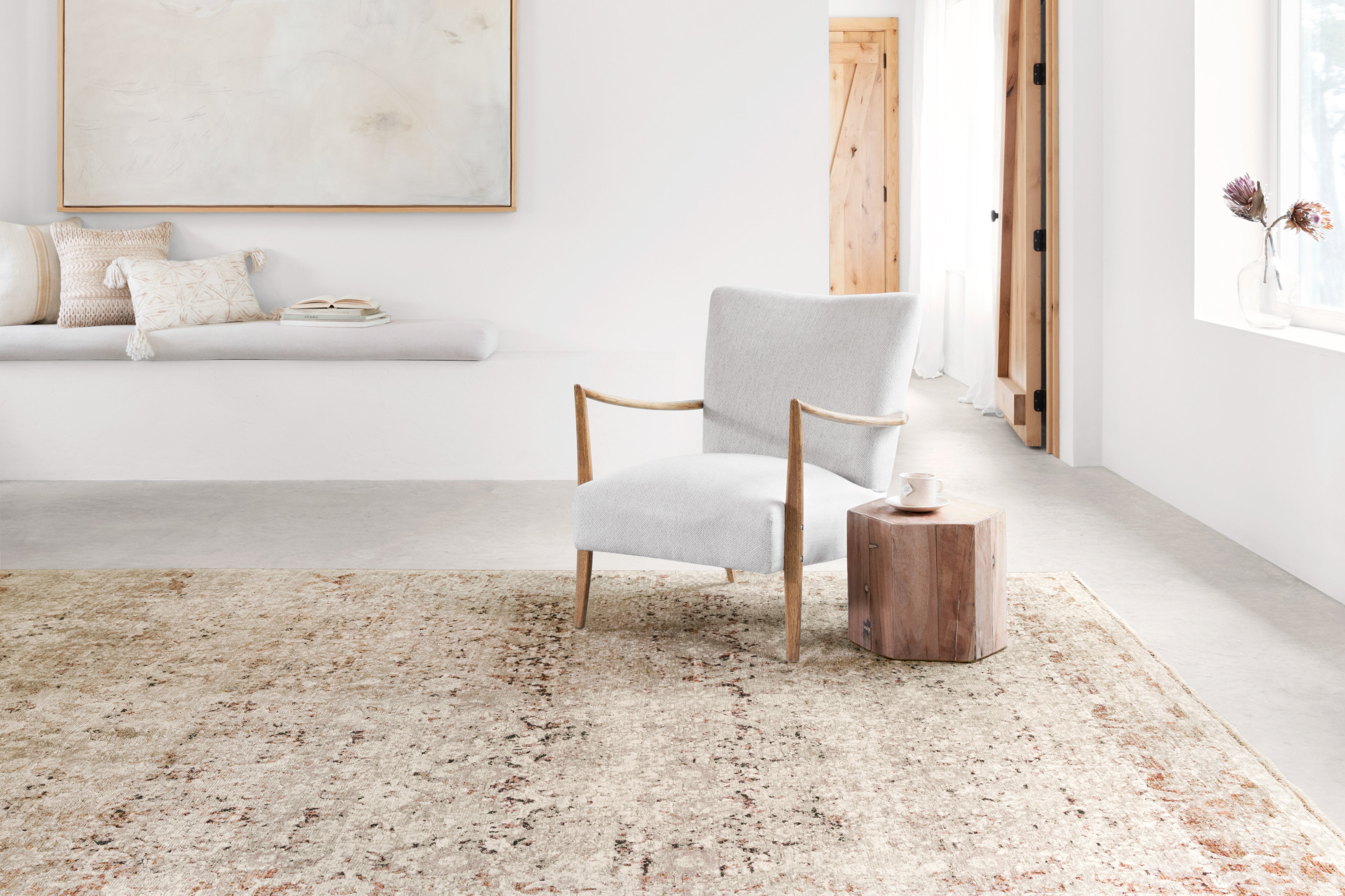
On dark wood floors, lighter rugs often feel fresh and architectural. Ivory, sand, light gray, faded blue, and warm neutrals can lift the room and prevent it from feeling heavy. On very light floors, deeper rug colors can ground the space beautifully, especially in open rooms where furniture needs visual anchoring.
With medium-toned wood, you have the most flexibility, but undertone still matters. Red-toned floors pair best with rugs that share some warmth. Gray-washed floors often look sharper with cooler neutrals, muted blues, or soft stone shades. If the rug and floor are too close in value but not quite the same tone, the result can feel muddy rather than layered.
If you have patterned tile, bold stone, or strong flooring variation, a calmer rug palette usually gives the eye somewhere to rest.
Pull From What Is Already in the Rug
When shoppers fall in love with a patterned rug, they often focus only on the main color. In practice, the smaller colors are just as useful. A rug with an ivory base and touches of sage, clay, denim, and brown gives you several styling paths. You do not need to match every color in the room to the rug. You only need to repeat one or two tones elsewhere so the palette feels connected.
This is especially helpful in transitional, traditional, and vintage-inspired designs, where rugs often contain layered tones that make the room feel richer. A faded rug with warm blush and muted blue can work in a surprisingly broad range of interiors because it acts like a bridge between warm and cool pieces.
This is also why online rug shopping benefits from close attention to detail shots and color descriptions. A rug that reads beige from a distance may actually include soft gray, tobacco, and ivory that make it much easier to coordinate than a single-color product image suggests.
Consider Light Before You Commit
Natural light changes rug color more than many people expect. South-facing rooms can warm up neutrals and make creams look more golden. North-facing rooms can cool a palette and make beige turn slightly flat or gray. Evening lamplight adds another layer, especially in cozy spaces like bedrooms and dens.
If your room gets limited daylight, a rug with some lighter notes usually keeps the space from feeling closed in. In bright rooms, deeper rugs can look especially handsome because natural light reveals their variation and texture.
Texture matters here, too. A low-pile printed rug and a plush tufted rug in the same color family can look completely different once light hits them. Matte finishes feel softer and more relaxed. Slight sheen can make color read richer and more formal.
Match Mood, Not Just Color
The most beautiful rooms are not only color coordinated. They feel emotionally consistent. A serene bedroom may call for soft blue, ivory, sand, or pale gray. A collected, character-rich sitting room may welcome deeper rust, olive, navy, or tobacco. A modern living room often benefits from quiet contrast, such as cream with black, taupe with charcoal, or greige with subtle slate.
When a rug color feels right but the room still looks off, the problem is often mood. A high-contrast geometric in sharp black and white might technically match your palette, yet feel too energetic for a restful bedroom. A faded traditional rug may tie together your furniture colors perfectly, but feel too gentle for a crisp contemporary dining room.
Color works best when it supports the atmosphere you want to live with every day.
A Few Room-by-Room Color Cues
Living rooms usually benefit from rugs that connect the sofa and accent seating, especially in open layouts. Bedrooms often look best with softer, quieter palettes that make the bed feel more inviting. Dining rooms can handle stronger contrast and richer pattern because the table breaks up much of the rug surface. Hallways and entryways are practical spaces, but they still set the tone. Rugs with mixed colors and subtle pattern tend to hide wear gracefully while adding polish from the first step inside.
For homes with kids, pets, or heavy foot traffic, medium-value rugs are often the sweet spot. Very light rugs can be stunning, but they show more. Very dark rugs can reveal lint, dust, or pet hair. A thoughtfully blended palette with variation tends to be the easiest to live with.
When You Are Between Two Colors
If you are torn between a lighter rug and a darker one, ask what the room needs more - lift or grounding. If the furniture feels heavy, go lighter. If the room feels airy but unanchored, go deeper. If you are choosing between a warm neutral and a cool neutral, let the largest upholstered piece decide.
And if two options both work, choose the rug that gives you more styling flexibility. Multi-tone rugs often age better with your décor because they can absorb small changes over time, from new pillows to a different paint color to a future chair you fall in love with.
At Rug Resources, that balance of beauty and practicality is exactly what makes shopping feel more confident. The right rug color should not just look lovely in a product photo. It should make your room feel finished, livable, and distinctly yours.
A well-matched rug does more than coordinate with your furniture. It settles the room, softens the edges, and gives the whole space a sense of belonging.
Share:
8 Bedroom Rug Placement Ideas That Work
Rug Trends 2026 That Will Shape Every Room