A rug can settle a room in seconds - or throw it off just as quickly. If you have ever loved a rug on its own but struggled once it was in your living room or bedroom, color is usually the reason. Knowing how to style rugs by color helps you create a space that feels intentional, comfortable, and visually calm, even when your furniture and finishes are doing a lot.
The good news is that rug color does not have to match everything perfectly. In fact, the most inviting rooms usually have a little tension built in. A rug can soften sharp contrasts, echo a favorite accent, or introduce a fresh tone that gives the whole space more character. The goal is not a formula. It is balance.
How to style rugs by color without overthinking it
Start by deciding what role you want the rug to play. Some rugs are quiet foundations. Others are the reason the room feels memorable. If you treat every rug like a statement piece, the space can feel busy. If you treat every rug like a background layer, the room can feel flat. Color helps you choose the right lane.
Look first at the largest surfaces in the room: flooring, walls, sofa upholstery, bedding, and window treatments. These elements create the color temperature of the space. If most of them lean warm - think camel, ivory, brass, walnut, rust, or creamy white - a rug with warm undertones will usually feel more integrated. If the room leans cool with charcoal, slate, blue, crisp white, or pale gray, a cool-toned rug often feels more natural.
That said, contrast can be beautiful when it is done with intention. A warm vintage-inspired rug under a cool gray sofa can add life and keep the room from feeling sterile. A blue-gray rug in a room full of warm oak can create a cleaner, more tailored look. The trick is repeating the contrast somewhere else, perhaps in pillows, art, or pottery, so the rug does not feel accidental.
Match the mood before you match the palette
Color affects mood as much as style. This is where many rug decisions become easier.
If you want a room to feel serene, lean toward soft neutrals, muted blues, sage, clay, faded terracotta, and tonal patterns with gentle variation. These shades create a composed backdrop and are especially effective in bedrooms, sitting rooms, and open-concept spaces where visual calm matters.
If you want energy, richer color works harder. Deep navy, forest, brick, gold, black, and saturated multicolor designs can anchor a room and give it a stronger point of view. These rugs tend to suit dining rooms, studies, entryways, and living rooms that need more depth.
There is also the question of formality. Cream and taupe can feel airy and elegant, but they may show more in a home with kids, pets, or heavy foot traffic. Darker rugs often hide daily wear better, though very deep solid colors can reveal lint or dust. Pattern helps here. A rug with color variation is usually more forgiving than a flat single-tone look.
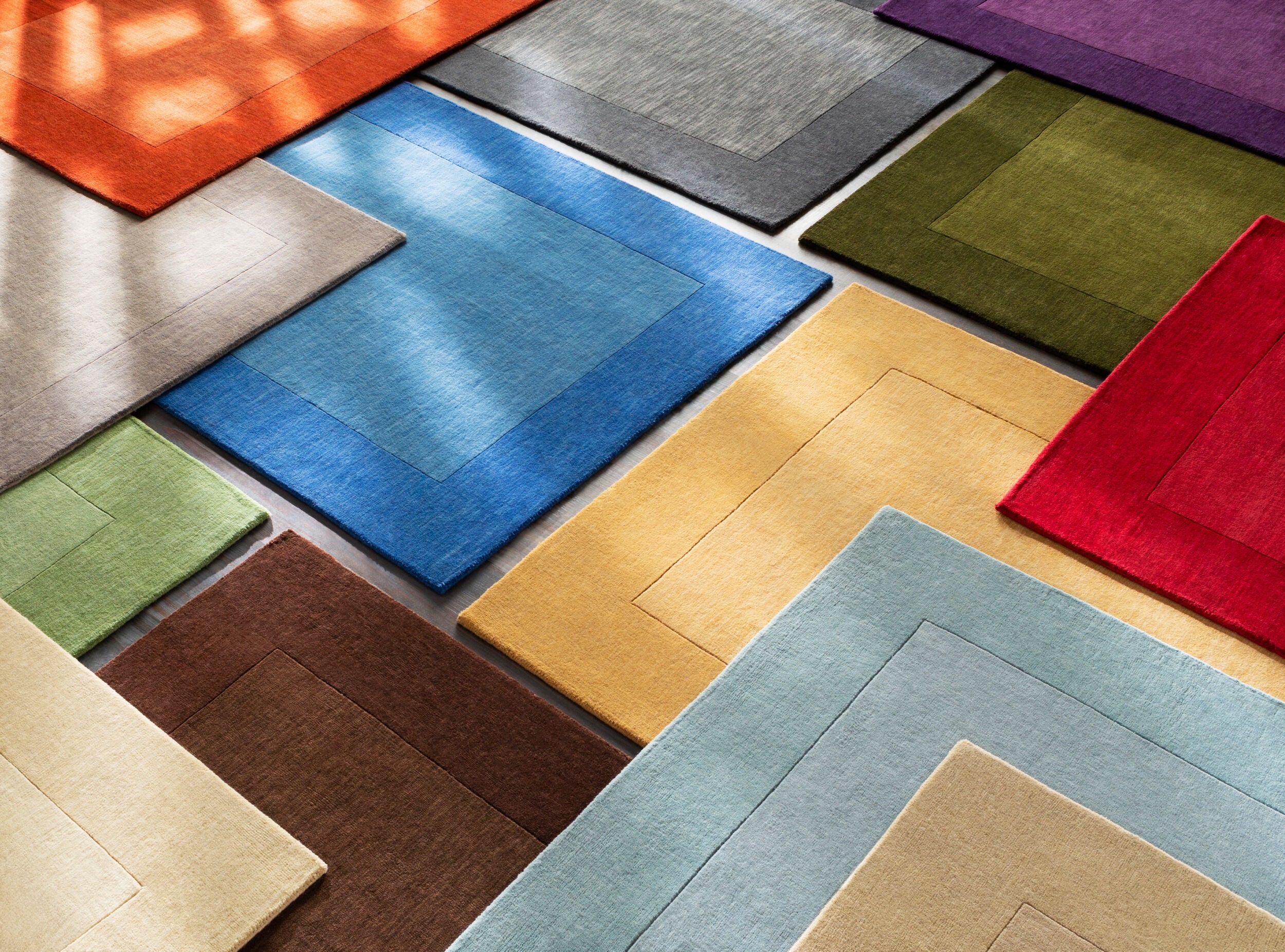
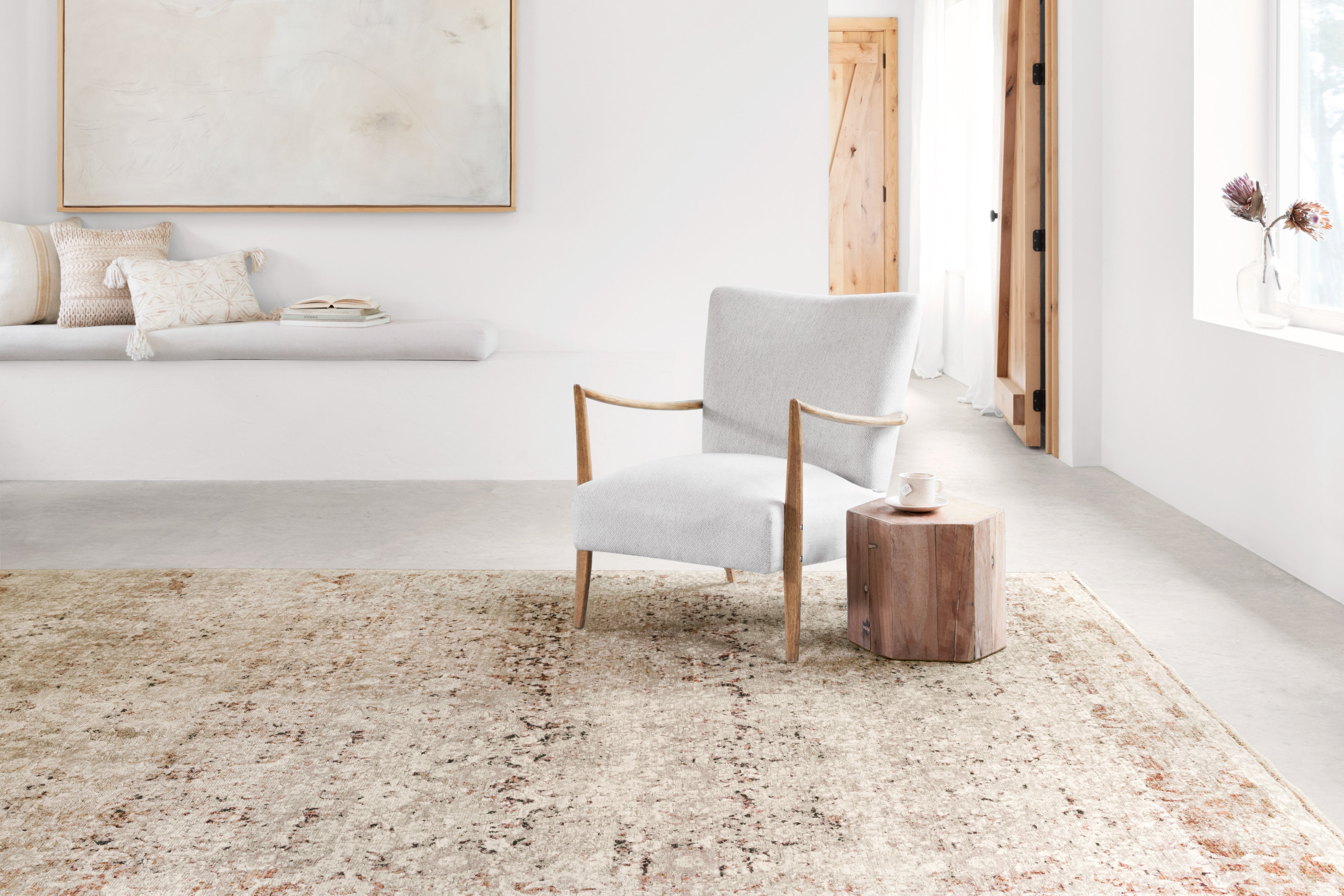
Styling neutral rugs by color
Neutral rugs are often seen as the safe choice, but they are only successful when the room has enough texture and tonal layering. A beige rug under beige furniture can feel refined and tranquil, or it can disappear completely. The difference is contrast in material and shade.
If your rug is ivory, oat, sand, taupe, gray, or greige, build around it with variation rather than exact matches. Pair a warm ivory rug with walnut wood, linen upholstery, matte black accents, and soft camel pillows. Use a cooler gray rug with crisp white walls, brushed nickel, charcoal textiles, and pale oak. This creates dimension while keeping the palette cohesive.
Neutral rugs are also ideal when your furniture or art already carries the room. In those cases, the rug should support rather than compete. A subtle border rug, a tonal geometric pattern, or a heathered solid can give the floor presence without pulling focus.
Styling blue, green, and other cool-toned rugs
Cool-toned rugs bring a sense of ease to interiors, especially in spaces that need freshness. Blue is one of the easiest rug colors to style because it behaves almost like a neutral, depending on the shade. Navy grounds a room beautifully and works well with ivory, cognac, brass, black, and natural wood. Pale blue feels lighter and is especially effective in coastal, transitional, and softly modern spaces.
Green rugs can be earthy or elevated. Sage and olive are subtle enough to live with long term, while emerald creates more drama. To keep green feeling sophisticated, pair it with warm whites, wood tones, leather, and touches of black or antique brass. If the room already has many botanical elements, a green rug can reinforce that natural story without becoming too literal.
With cooler rug colors, be mindful of lighting. North-facing rooms can make cool tones feel flatter or more shadowy. In those spaces, adding warm woods, creamy textiles, and brass finishes keeps the room from feeling chilly.
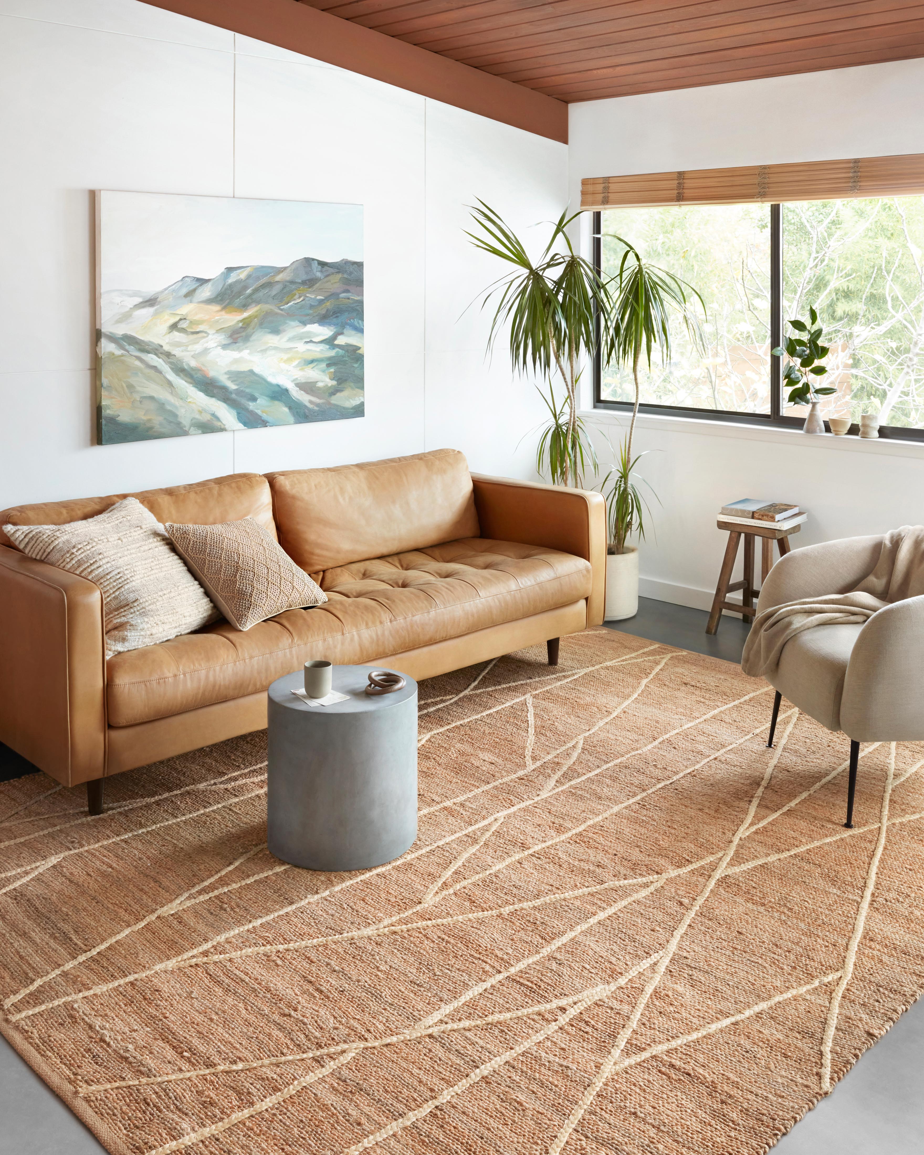
Styling red, terracotta, gold, and other warm rugs
Warm rug colors are rich with personality. They can make a room feel layered, collected, and welcoming, especially when the architecture or furniture feels plain. Traditional and vintage-inspired rugs often fall into this category, with notes of rust, wine, cinnamon, clay, blush, and gold woven through the design.
The easiest way to style a warm-toned rug is to let one or two secondary colors in the pattern guide the rest of the room. A terracotta and blue rug, for example, gives you an instant palette. You might echo the blue in throw pillows and artwork while letting the terracotta speak to wood furniture, leather, or warm metal finishes.
If you are worried a warm rug will overwhelm the room, create breathing space around it. Upholstery in cream, flax, soft gray, or light brown helps strong rug colors feel edited rather than heavy. This is especially useful in smaller living rooms and bedrooms where every color carries more visual weight.
How to style rugs by color in different rooms
Room function matters. The right color in one space may feel off in another.
In living rooms, a rug often needs to bridge several elements at once - sofa, chairs, coffee table, media console, and art. Multi-tone rugs work especially well here because they connect more than one finish or fabric. If your furniture is fairly neutral, this is the best room to bring in deeper color.
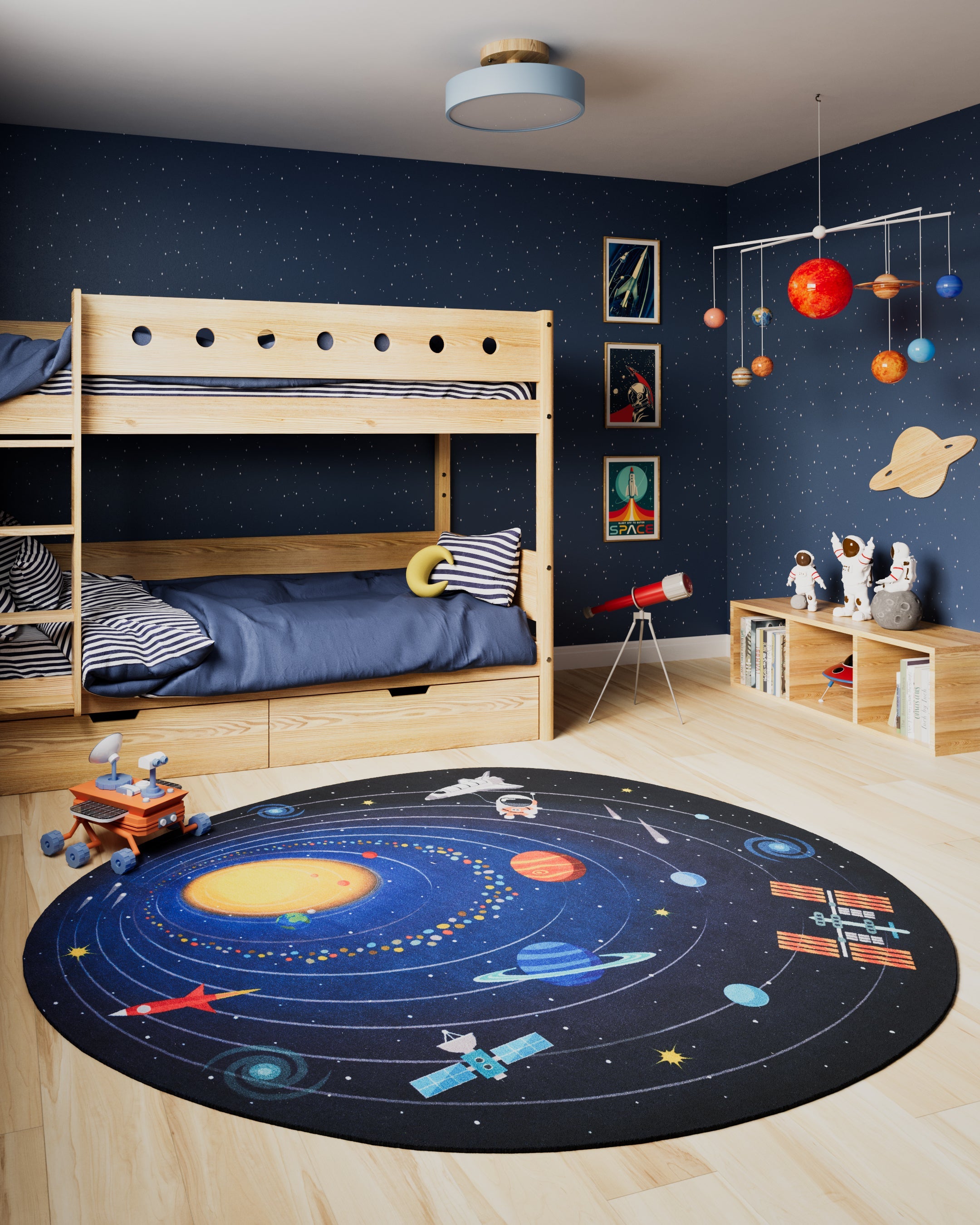
In bedrooms, quieter palettes usually win. A rug in cream, muted blue, soft gray, blush, or sage tends to support a restful atmosphere. Plush texture can make even a simple color feel luxurious. If your bedding already includes pattern, a more tonal rug keeps the room from becoming visually crowded.
In dining rooms, darker or patterned rugs are often practical as well as stylish. They disguise the realities of daily use more gracefully and help define the table area. For hallways and runners, medium to darker tones with movement in the pattern tend to wear beautifully and maintain their character over time.
When to coordinate and when to contrast
A common question is whether the rug should match the sofa, wall color, or curtains. Usually, it should relate rather than match. Exact matching can feel staged unless the room is very minimal and intentionally tonal.
Coordinate when you want a room to feel calm and expansive. This works well in smaller rooms, bedrooms, and open spaces where visual flow matters. Contrast when the room needs definition, energy, or a stronger focal point. A darker rug under lighter furniture can ground a seating area beautifully. A lighter rug under a dark sectional can lift the whole composition.
If you are shopping online, this is where product details matter. Look closely at undertones, pattern scale, and material cues. A rug described as ivory may read creamy, while gray can lean blue, taupe, or charcoal. Customer reviews and room photos can also offer reassurance when you are narrowing down a color family.
The most successful rug color is rarely the one that shouts the loudest. It is the one that makes everything else in the room look better. When you choose with mood, undertone, and daily life in mind, color becomes less intimidating and far more useful. Trust the room you are building, not just the rug you are admiring, and the right choice will feel beautifully obvious once it is in place.
Share:
This Isn’t Just a Rug — It’s a Love Letter to the Past, and It Comes in the Softest Pink You’ve Ever Seen
Neutral Rugs for Small Spaces That Work